Brand identity design
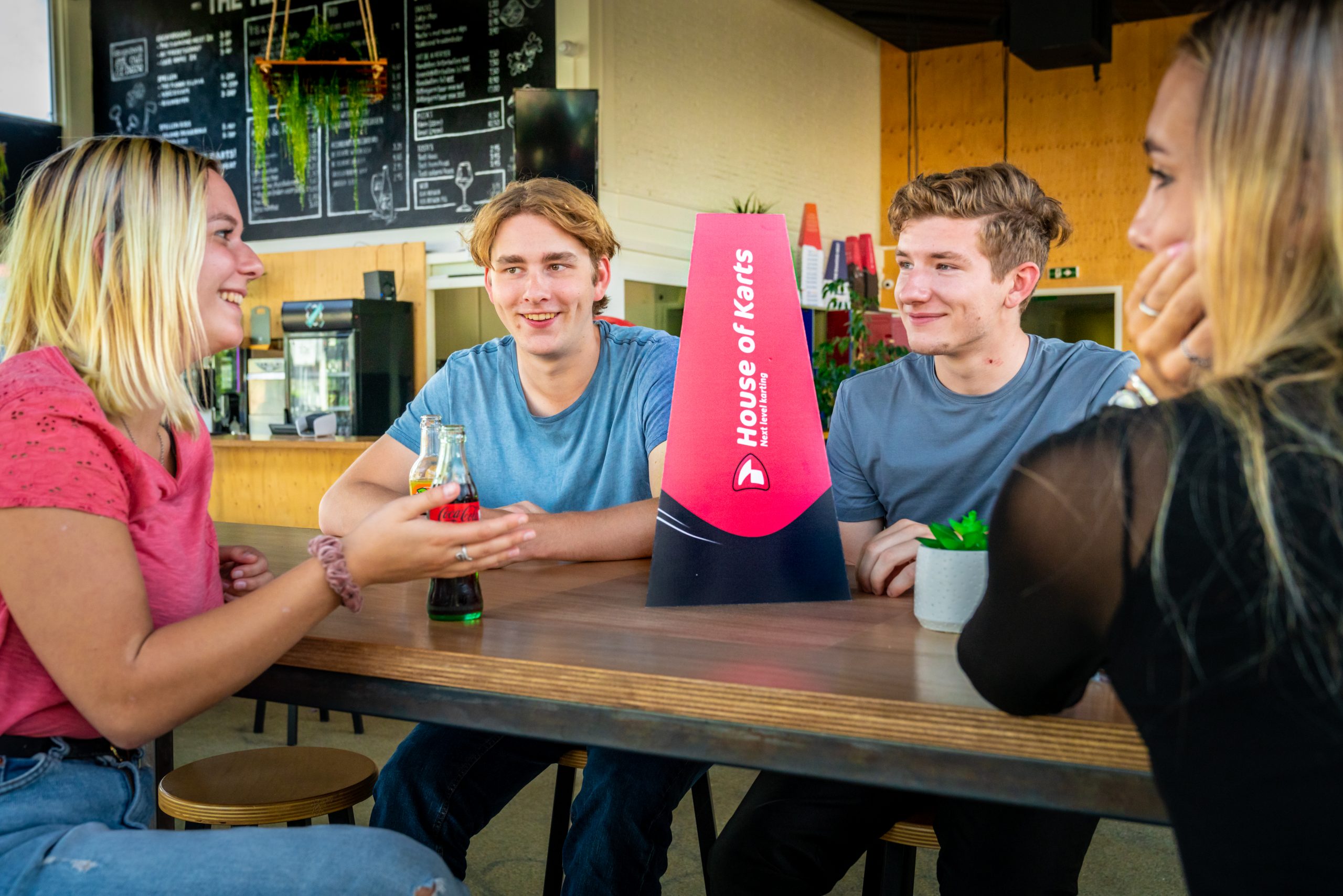
House of Karts
Introduction
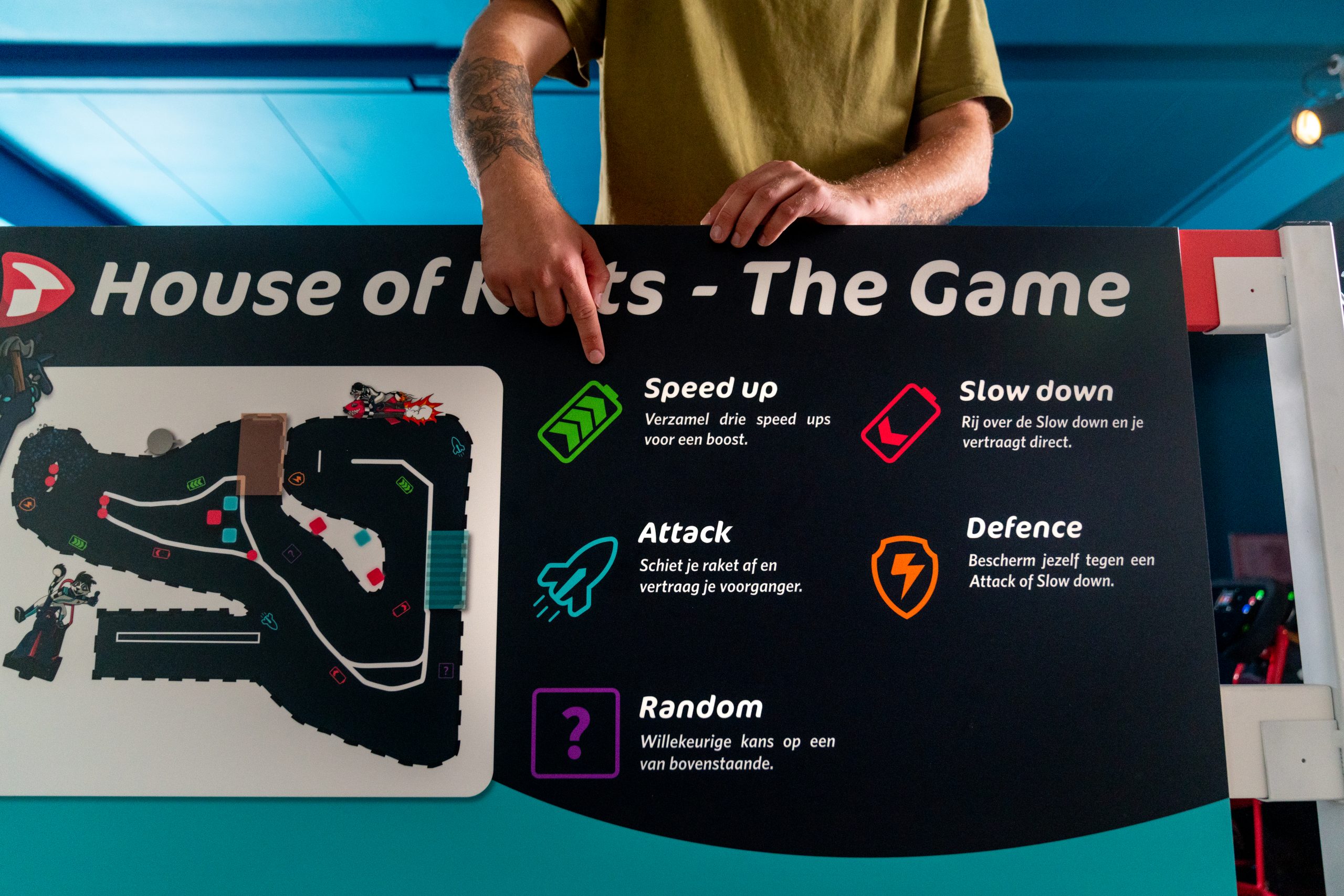
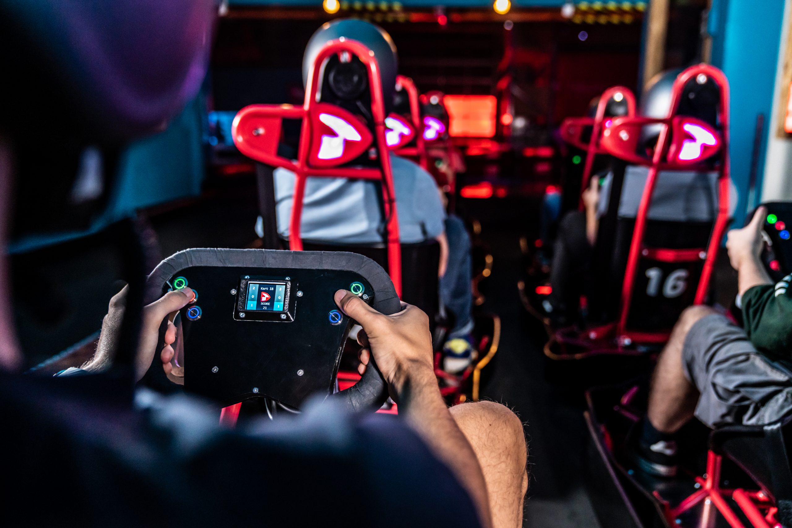
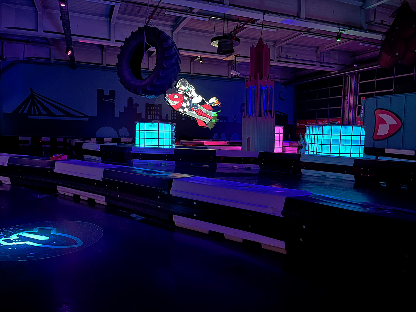
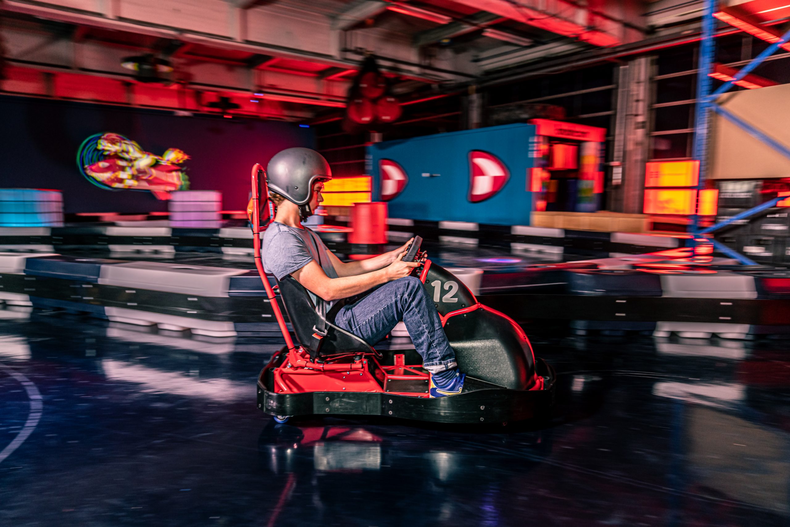
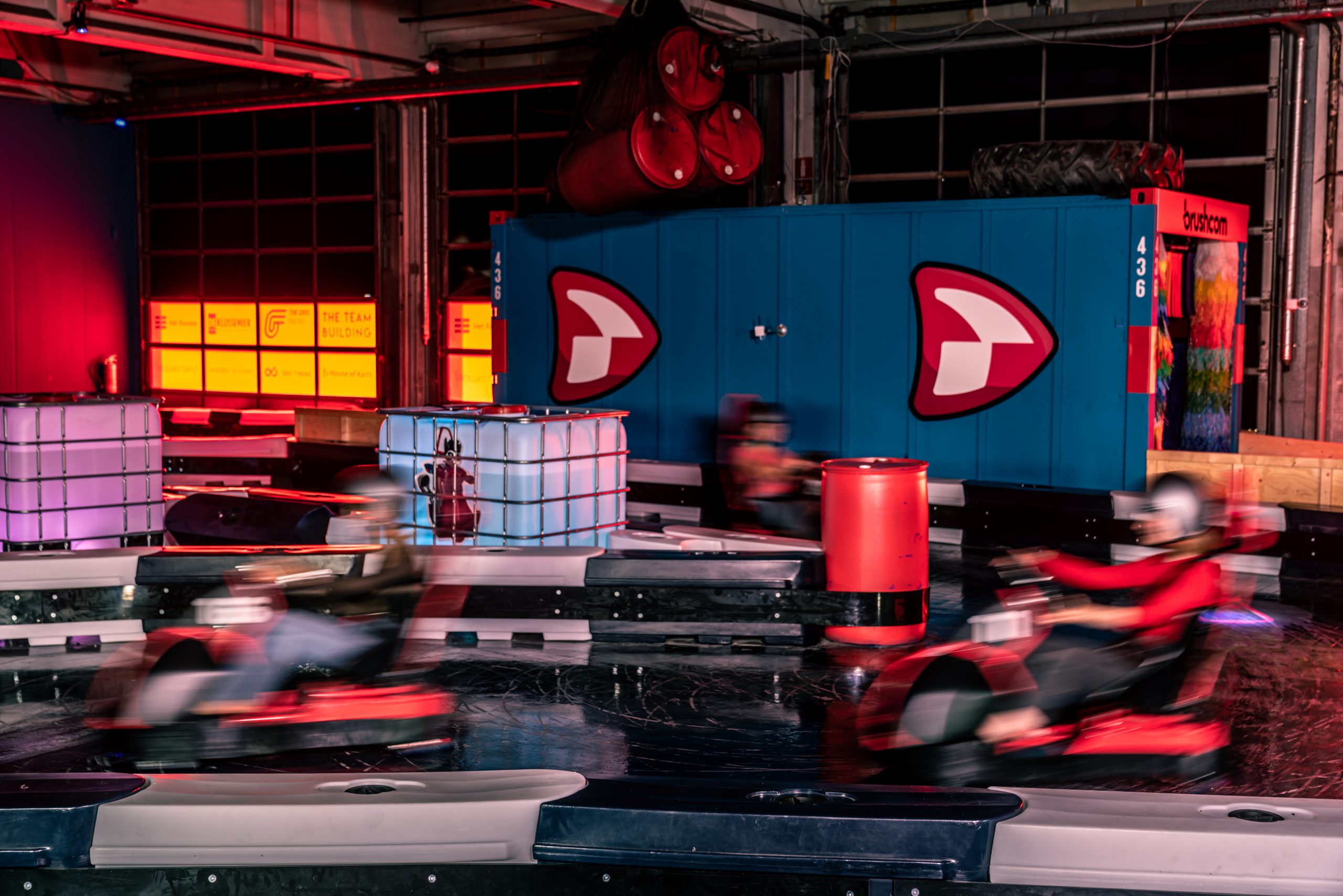
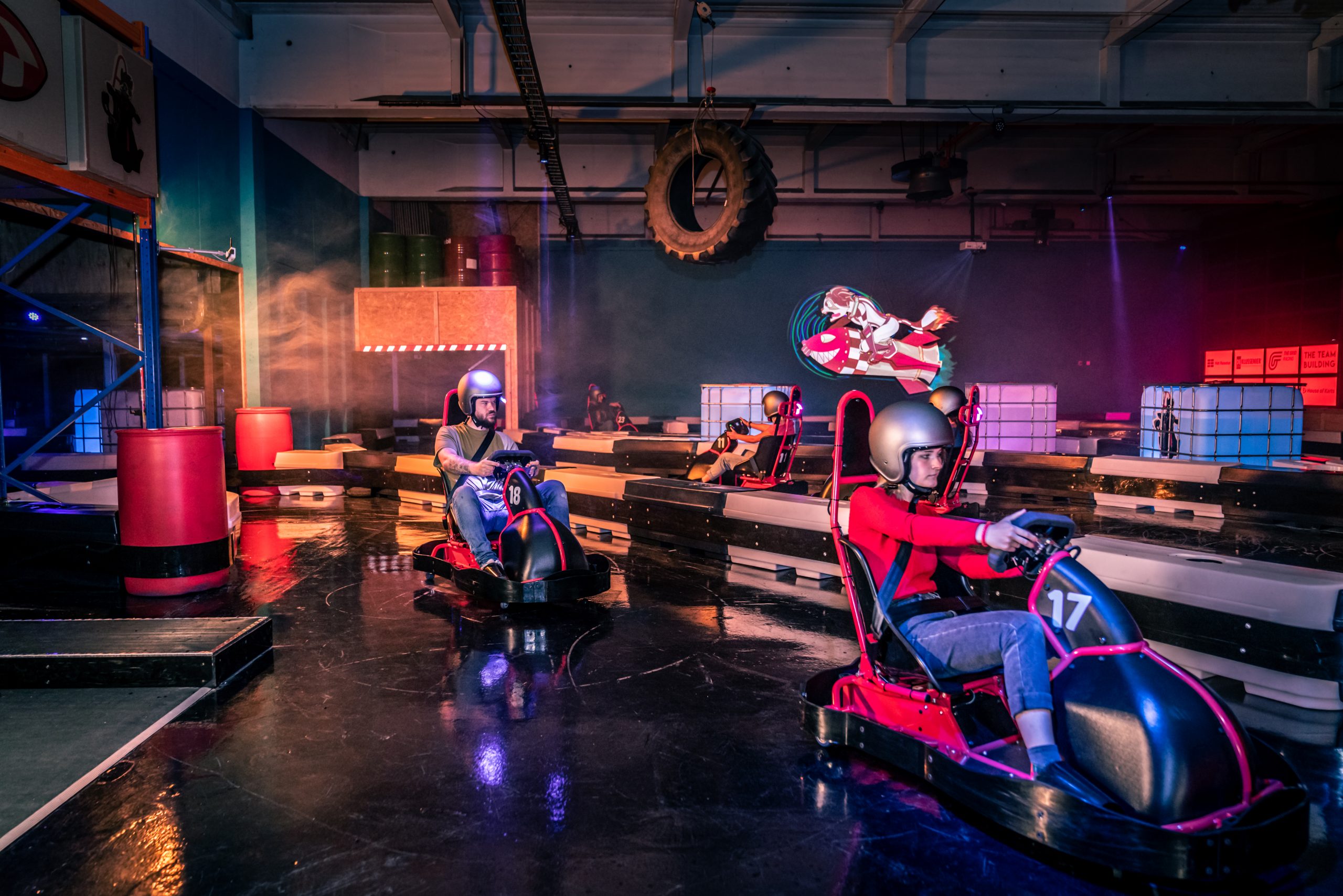
Drift with an electric-powered kart over the boosts on the ground and avoid obstacles to collect points.
House of Karts created a complete unique kart experience. I’m happy to say that I could help Paul and Joëlle on their way to conquer the world with this new experience. I had a blast designing their Brand Identity and mascot!
The initial assignment: ‘Set up a whole new brand with a corresponding visual appearance.’
The problem: the media introduced the concept as ‘Mario Kart, but in real life’. Something that Nintendo wasn’t too happy about. It became clear that House of Karts needed it’s own brand identity.
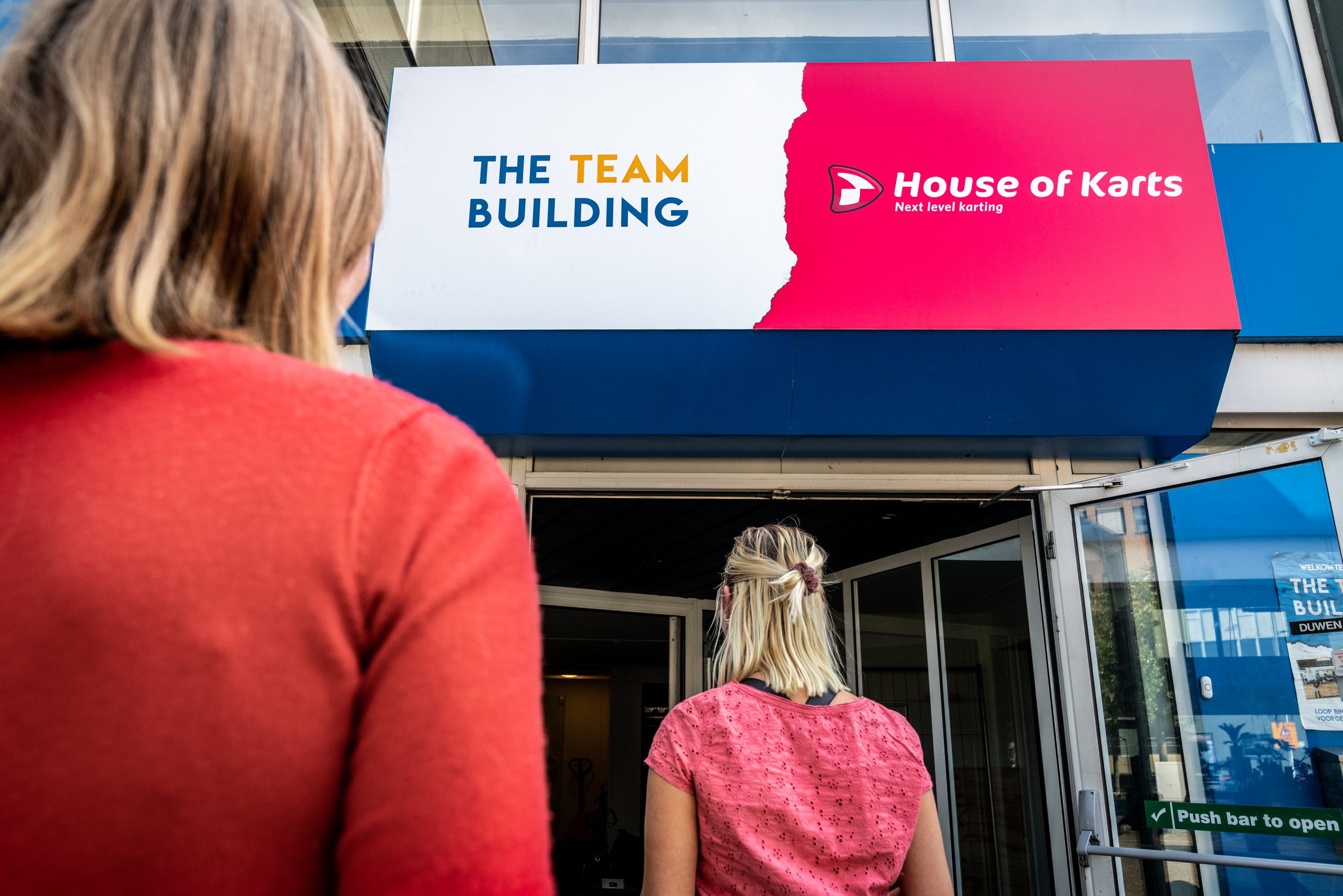
Walk in and take a look around!

Photo’s by: Marco Espinosa
Plan of attack
To successfully position House of Karts in the market, the market had to be mapped. So I did a focused research on three different environments. These are the Micro-environment, the Macro-environment and the Meso-environment.
These environments provided a clear picture of the market, so that the opportunities, threats, strengths and weaknesses of House of Karts could be visualized with a SWOT analysis.
Next, I used a confrontation matrix to pit the strengths, weaknesses, opportunities and threats against each other. This matrix confronts House of Karts with the market. It helped me to see the strategic issues for House of Karts.
With these insights the Create phase could begin. I made a marketing communication strategy to answer the strategic issues. Through advancing insight that was obtained from testing the concepts, I found out which brand identity best suits the wishes of the target group and those of the client.

Brand Value’s
- Innovative: Developing a new experience for you and your friends is the part we enjoy the most. That’s why we’ve added an extra dimension to go-kart racing and we will continue to expand this with new features.
- Challenging: We’re not afraid to make mistakes, we like to push the pedal to the metal! With a little humor, we challenge you to put your inner child behind the wheel.
- Playful: House of Karts is not a normal go-kart track. The playfulness of all our power-ups, the thematic track and light and sound effects make the experience completely immersive.
A dive in the past
House of Karts is all about having fun and reliving your childhood. That’s why I took a dive into the past to find out what the youth of the target group looked like. A collage has been made based on the most famous animation TV programs from their youth (do you know them all?). It soon became clear that these animation programs from the collage aroused a lot of nostalgia.
From the collage I learned that that thick outlines were used with a light shadow and bright use of color. besides that most of the eyes and heads are big and have smaller bodies. I used these insights in the design phase of the brand mascot.

Famous tv-animations
Desiging Rascal the Brand Mascot
I started by designing the brand mascot so that I could shape the brand based on its main brand carrier. After all, the brand mascot will literally become the face of the brand. Designing a brand mascot not only helps to establish a fitting house style for the brand, it also ensures recognisability, a playful appearance and distinctiveness. Exactly what House of Karts needs.
Together with the client we decided that a raccoon would fit well with the brand. The raccoon fits well with the keywords: ‘innovative, challenging and playful’, because it is a smart rascal that loves to play games.


Logo design
The logo had to look energetic and playfull. It derives from the shapes of a house, a play button and the racing tail of the brand character (racing flag). The logo is also in harmony with the font Cocon Pro.
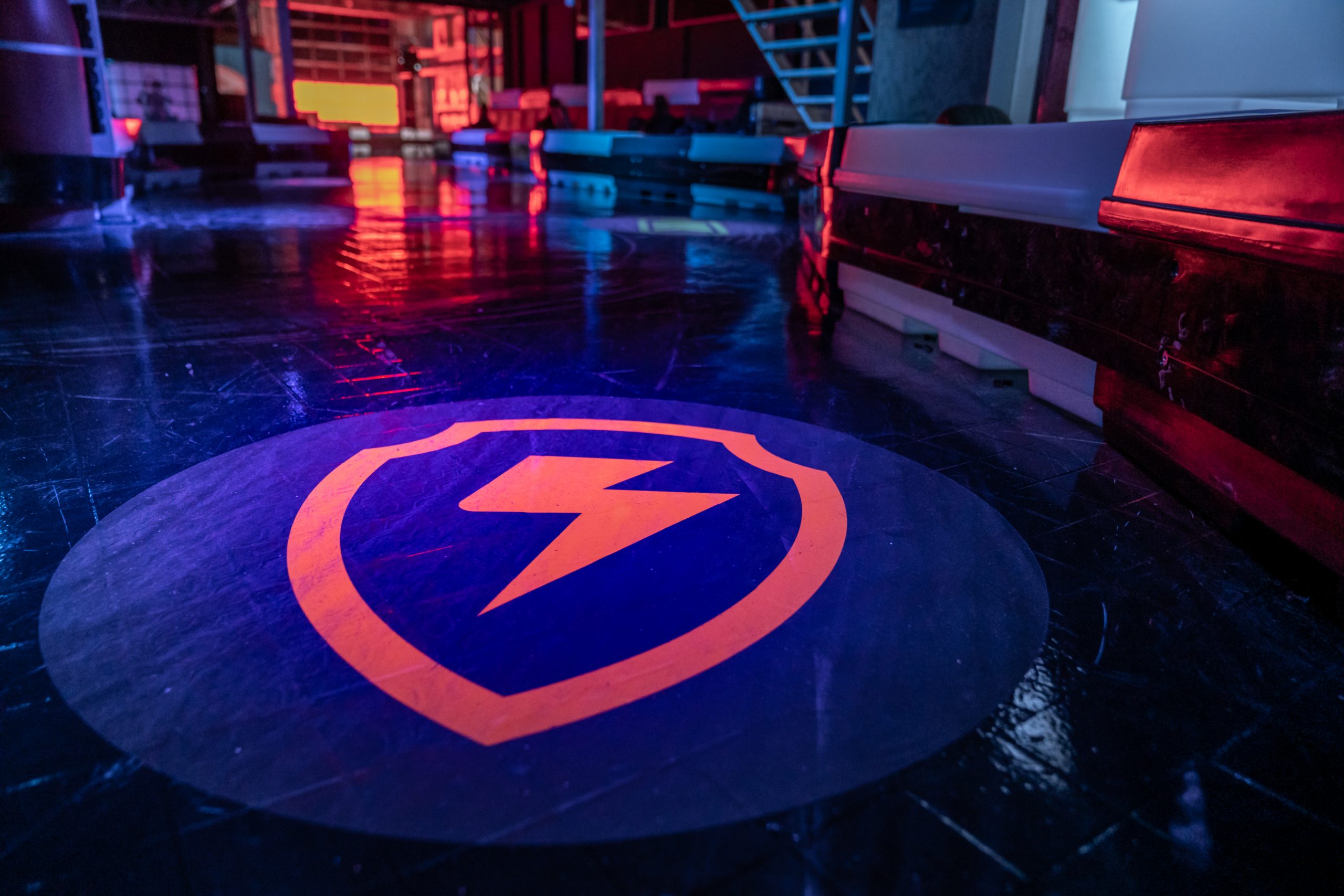
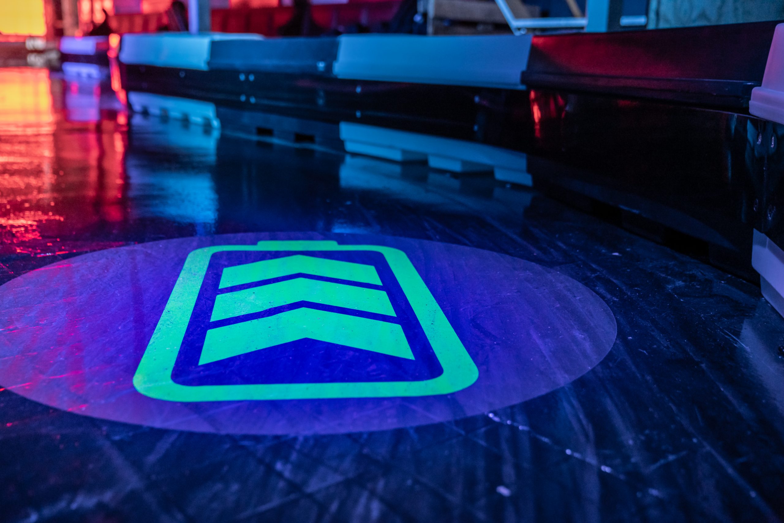
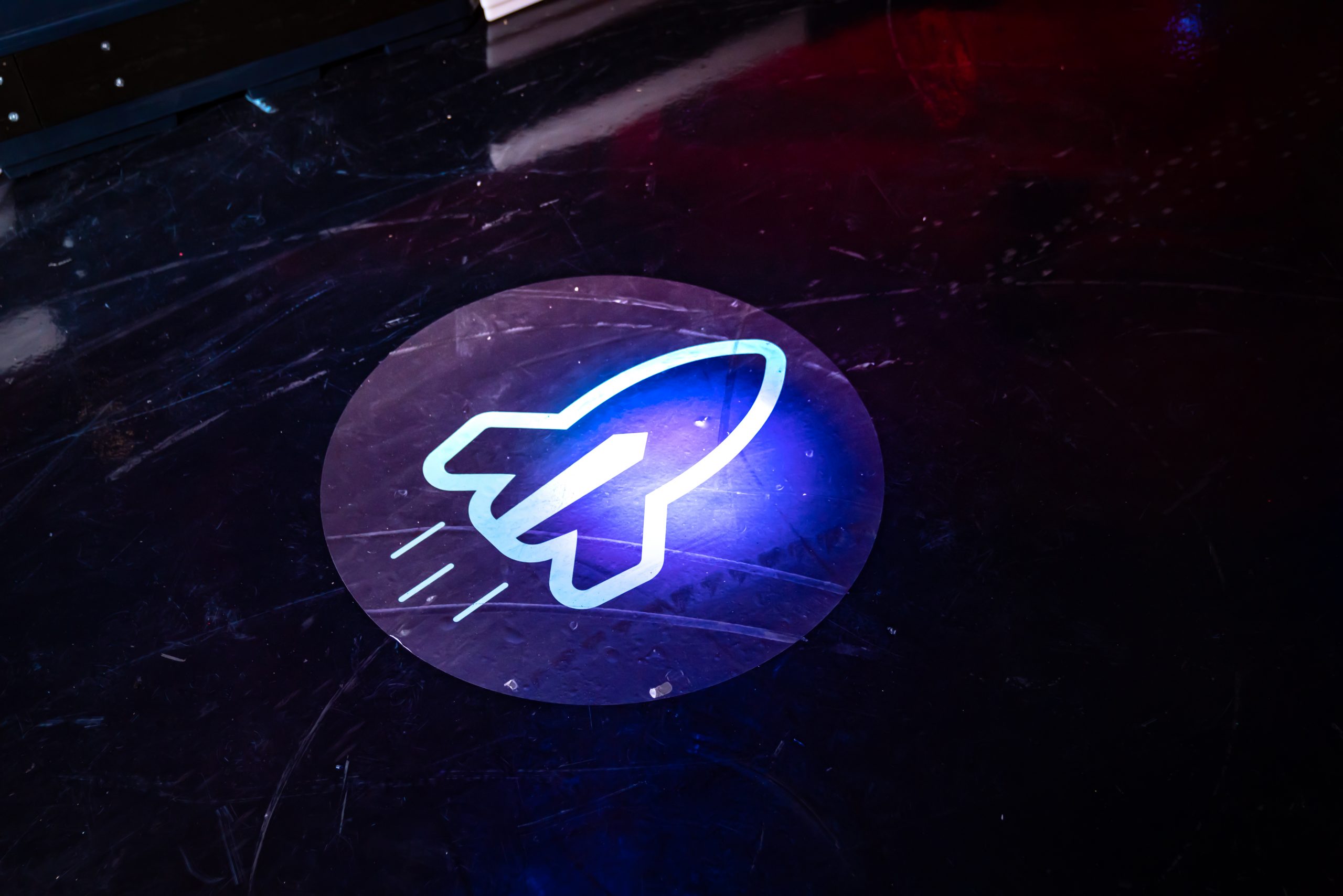
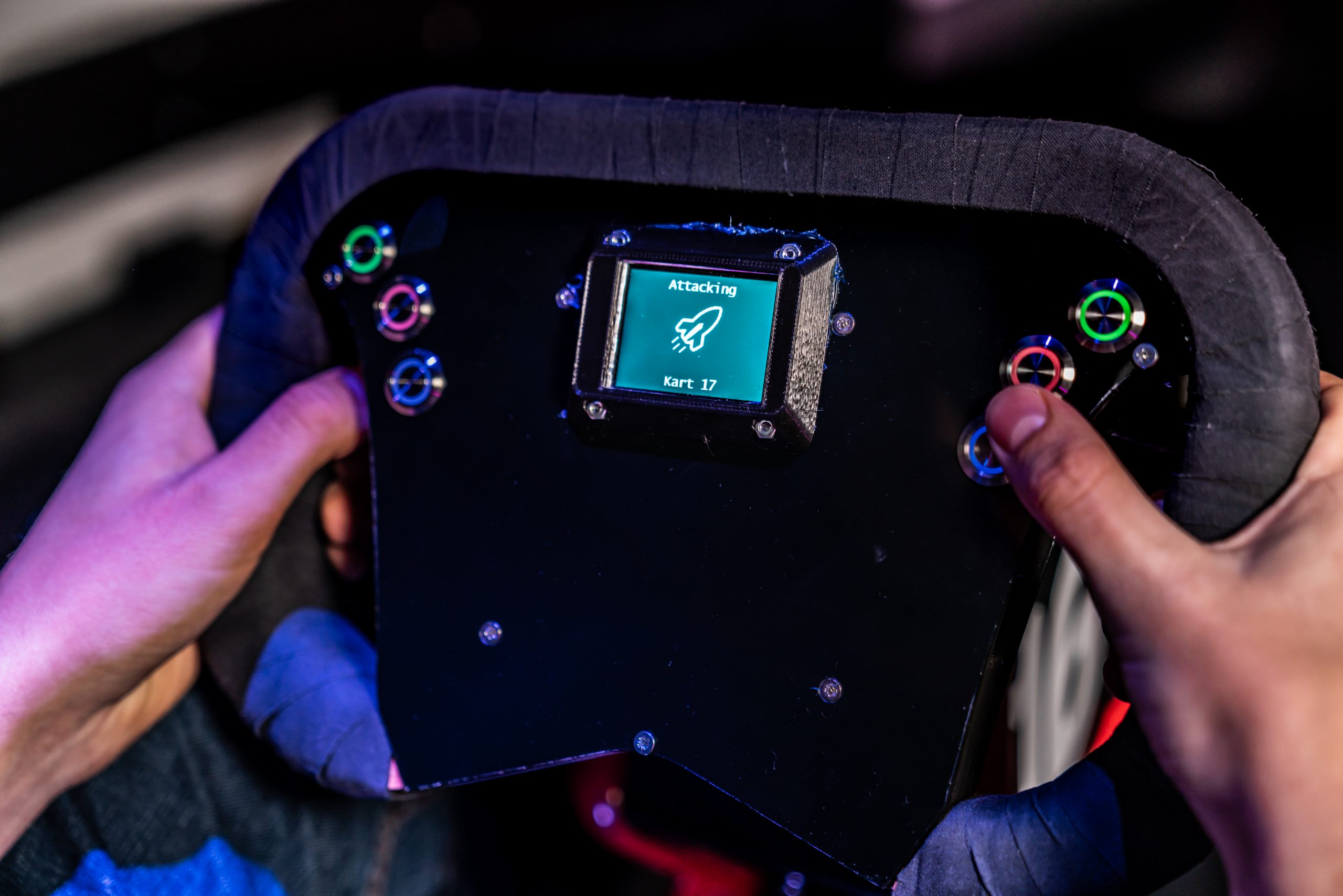
Power-ups
An important aspect of House of Karts are its 4 power-ups: Speed Up, Slow Down, Attack and Defense. These power-ups will be projected on the course. these power-ups will be projected onto the go-kart track.
I used the electric drive of the karts as inspiration for the power-ups.

Font choice
Primary font: Cocon Pro
A font that looks playful, challenging, fits the shapes of the brand mascot (see the curved points on Rascal’s haircut for example) and is easy to read from a distance.
Secondary font: Whitney
This font was designed for the Whitney Museum in New York. It had to be legible in many different formats. This is also necessary for
House of Karts. In addition, Whitney looks friendly because there are human ’tweaks’ in it.


Joëlle van der Pol
“Gino van Baak has developed our branding for our new leisure concept House of Karts. He has approached this process with great care and professionalism. We are very happy with the result; a color scheme, fonts, logo, character and power ups. You can see his work shine on our website www.houseofkarts.com. Afterwards we asked him to further develop the character called Rascal. He has made various illustrations for us of very good quality, which we use in all our expressions. In addition, Gino actively and creatively thinks along about improving the product and the appearance and is pleasant to work with.”
Creative Entrepreneur, House of Karts